Custom Illustration Style
CONFIDENTIAL CLIENT
Developing a science- and education-focused illustration style through the lens of Diversity, Equity, and Inclusion (DEI).
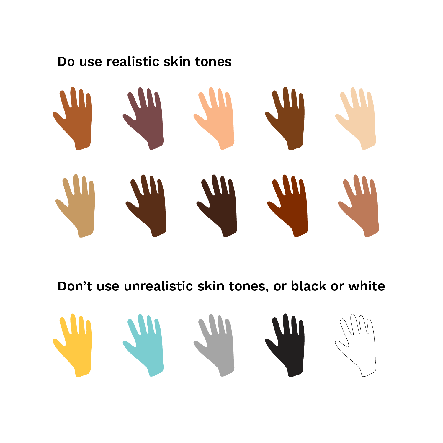
This client required a unique illustration style for their brand that could cohesively convey their many endeavors across education, community, tech, and science. It was also imperative that the illustrations embodied the organization’s diversity, equity, and inclusion values. To do this, we created a highly adaptable, geometric, and modular style that could be customized for any format and need. We also built a library of assets and a use guide to make sure diversity was overtly considered and mindfully engineered into the system.
ILLUSTRATION
BRAND GUIDELINES
MERCHANDISE
Key qualities of the illustration style
Texture & Color
Because geometric forms can often feel cold and flat, we introduced halftones to add warmth and nostalgia, shadows, and depth. A limited color palette keeps illustrations cohesive and optimistic.
Geometric forms
The majority of the illustration assets are based on geometric shapes. This gives a nod to the tech and science part of the brand, and works well with the modular layouts.
A community of real people
Each illustration tells a story, and the people in it have purpose. Diversity across gender, body type, ability, sexual orientation, religion, and more is considered in each illustration so that the community is representative of as many people as possible.
Adaptable + functional
We developed a full library of customizable assets (people, objects, scenery) that can be rearranged to create new compositions. The modular layout style allows many concepts to come together and adapt to any size.
Our top 5 DEI learnings for inclusive illustration


